AD450 · Brand identity & print advertising
Craft Lab
Building a visual identity for a fictional maker company, from a letterform logo to stationery and advertising.
Course project · Work in progress · 2026–present
At a glance
- Current deliverables
- A dimensional logo, five stationery artboards, and four advertising artboards created in Adobe Illustrator.
- My contribution
- Individual identity, typography, layout, and illustration work for a fictional company in AD450.
- Project boundary
- Ongoing coursework, not commissioned client work. The brochure, direct mail, booklet, and website deliverables remain planned.
 Identity → applications
The project
Craft Lab, also named Cee Craft Lab in the artwork, is a fictional company developed across my AD450 assignments. Inspired by my interest in designing and making small objects, the concept centers on personalized charms, jewelry, and 3D-printed pieces.
Each assignment extends the same identity into a different format. The aim is to make the pieces feel related while adapting the amount of information, scale, and layout to their intended use.
This is coursework, not a commissioned client project or an operating business. Company URLs, email addresses, and the “Manager” title shown inside the artwork are fictional course content, not my contact details or a professional role. Craft Lab is separate from Xiaoxi Studio LLC.
01 · Identity
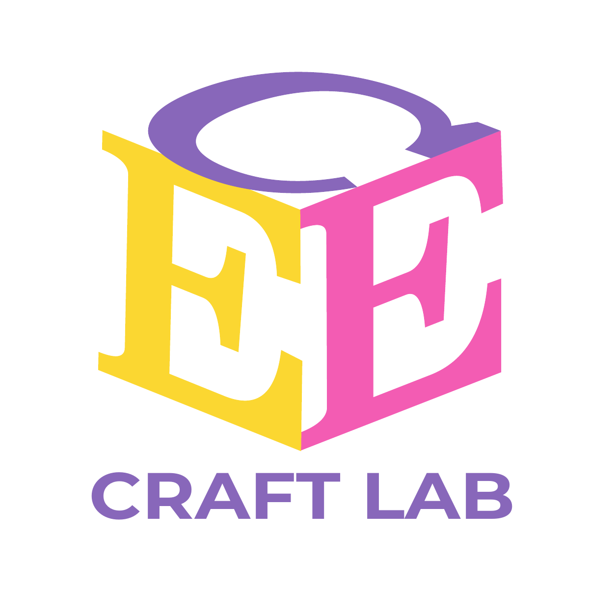
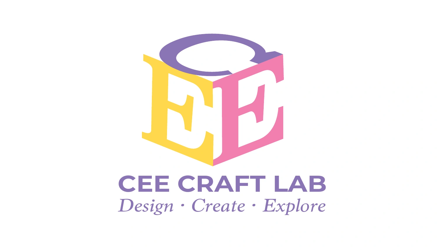
The Week 2 logo combines a purple C with yellow and pink E letterforms in a dimensional, cube-like arrangement. Perspective and overlap connect the mark to the idea of constructing an object.
Across later pieces, the symbol becomes both a compact signature and an oversized background graphic. Purple carries most of the type; yellow and pink add accents. The advertising also explores a purple-led logo variation.
02 · Stationery
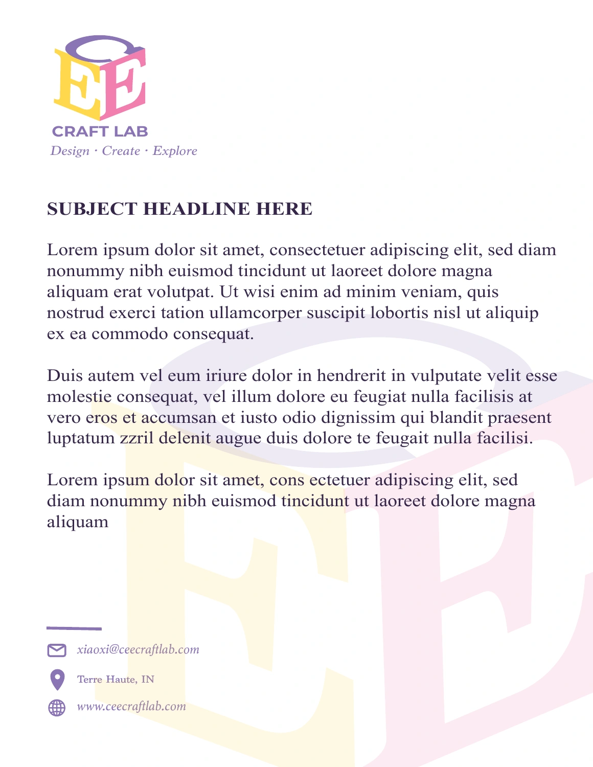
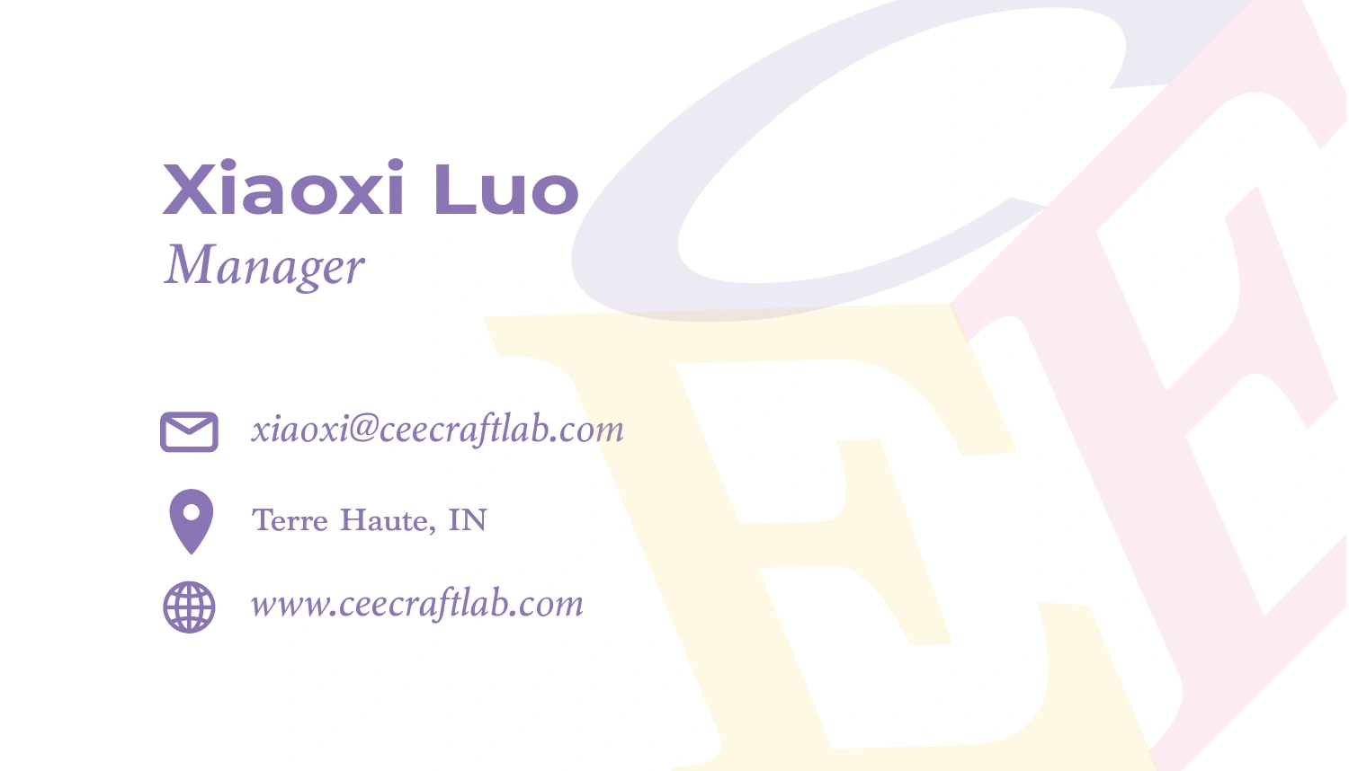
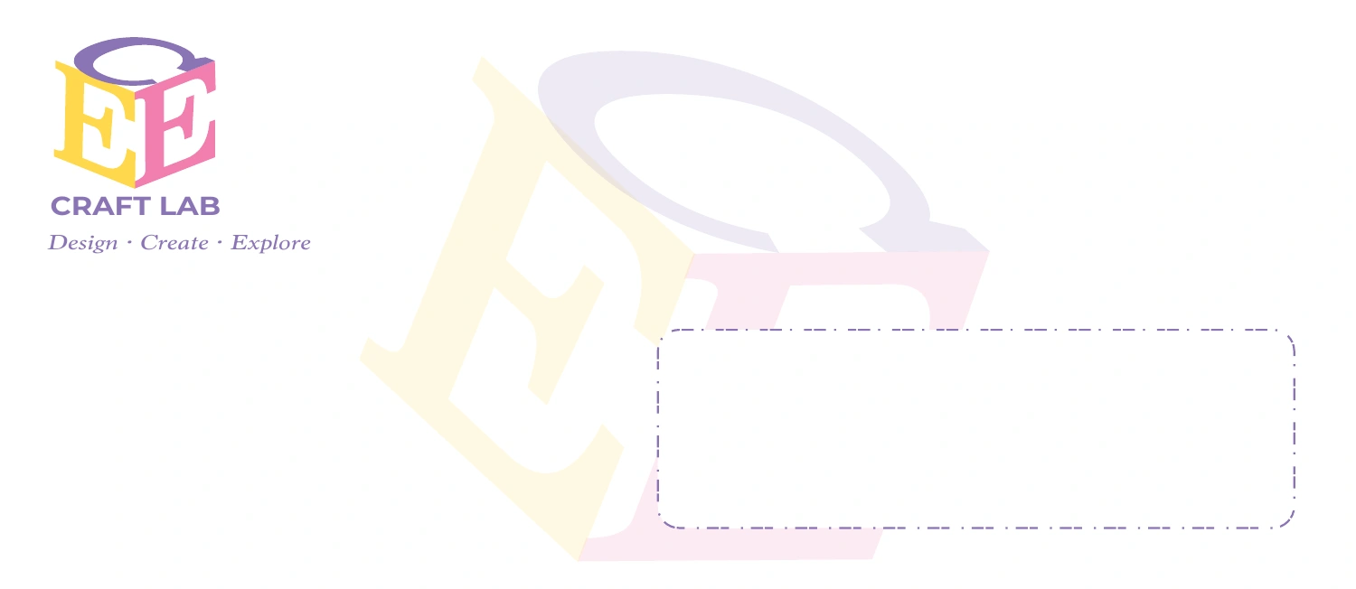
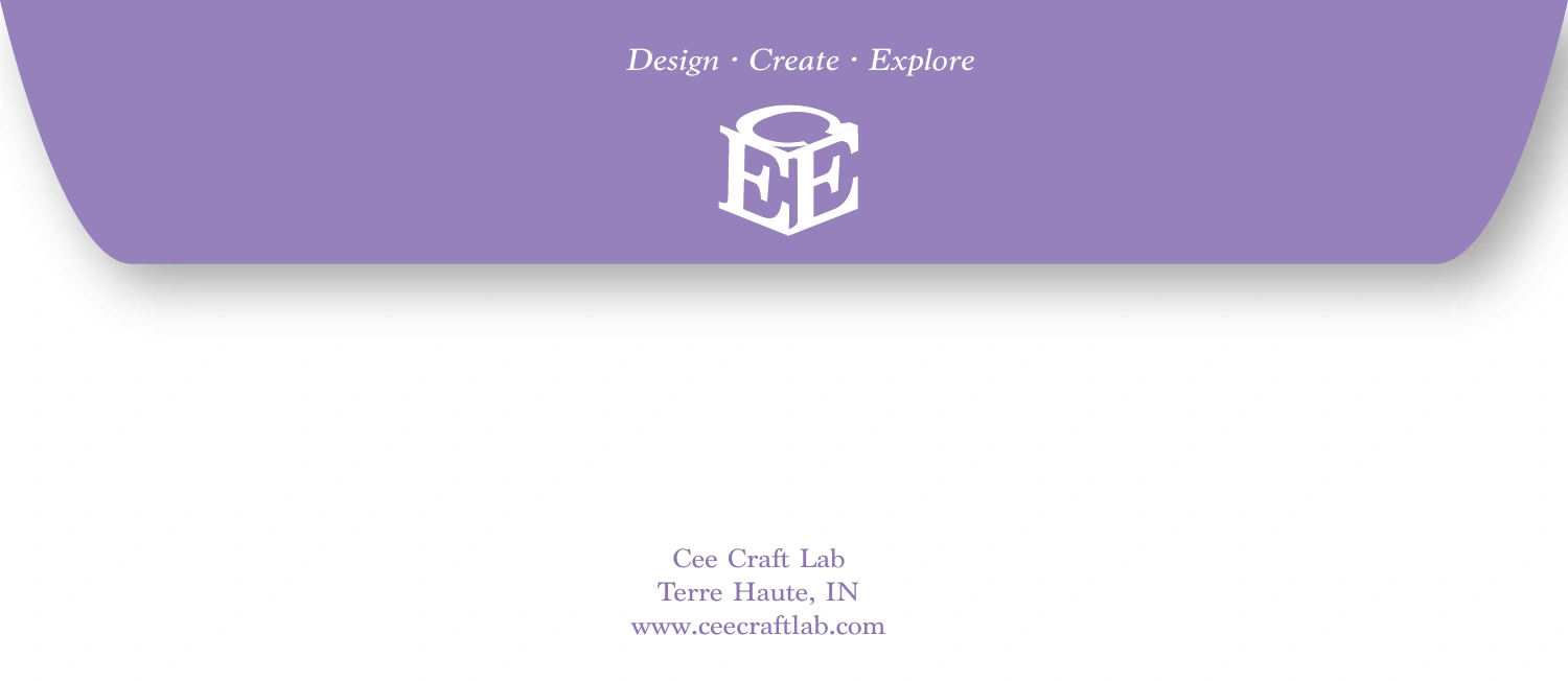
The Week 4 set carries the identity onto a letterhead, an envelope, and a two-sided business card. Pale, enlarged fragments of the mark create a shared background treatment, while the smaller logo and repeated tagline connect the individual layouts.
The five artboards below show the current digital designs. The letterhead uses placeholder body copy as part of the layout exercise.
03 · Print advertising
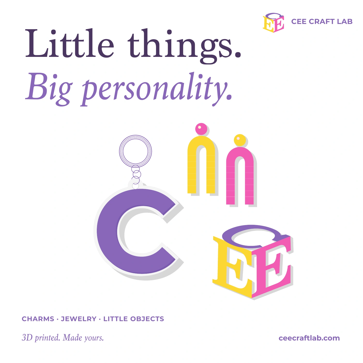
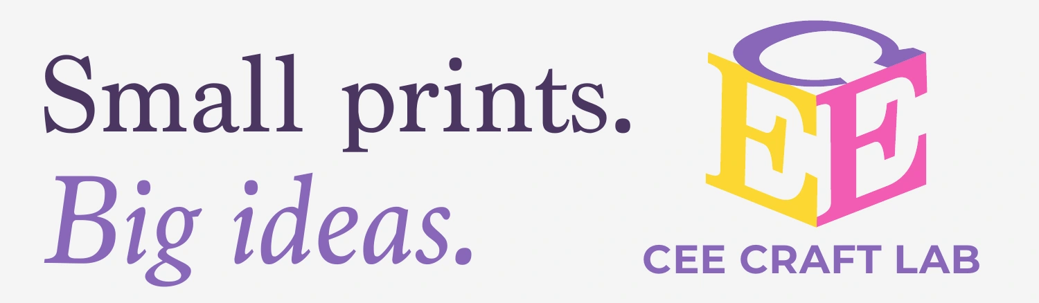
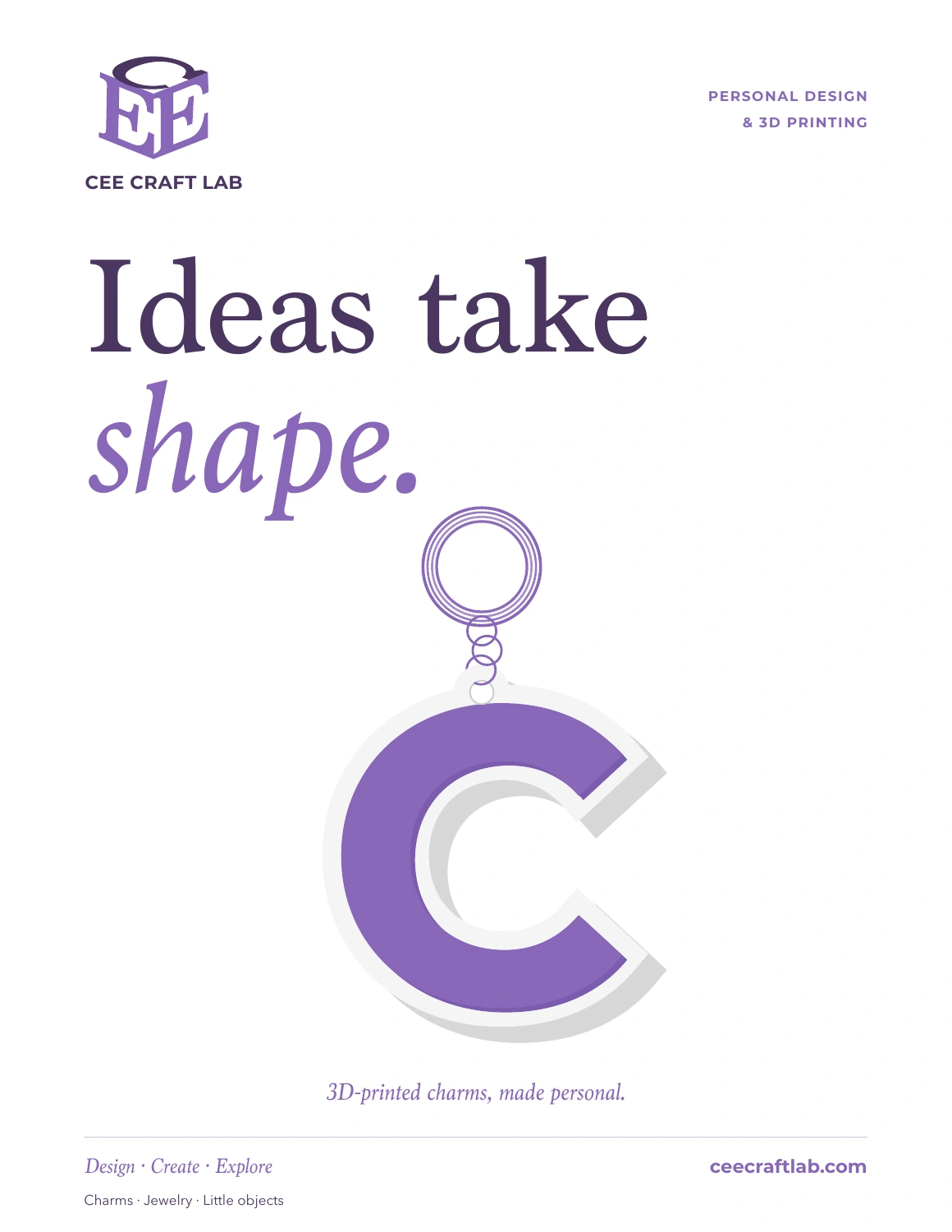
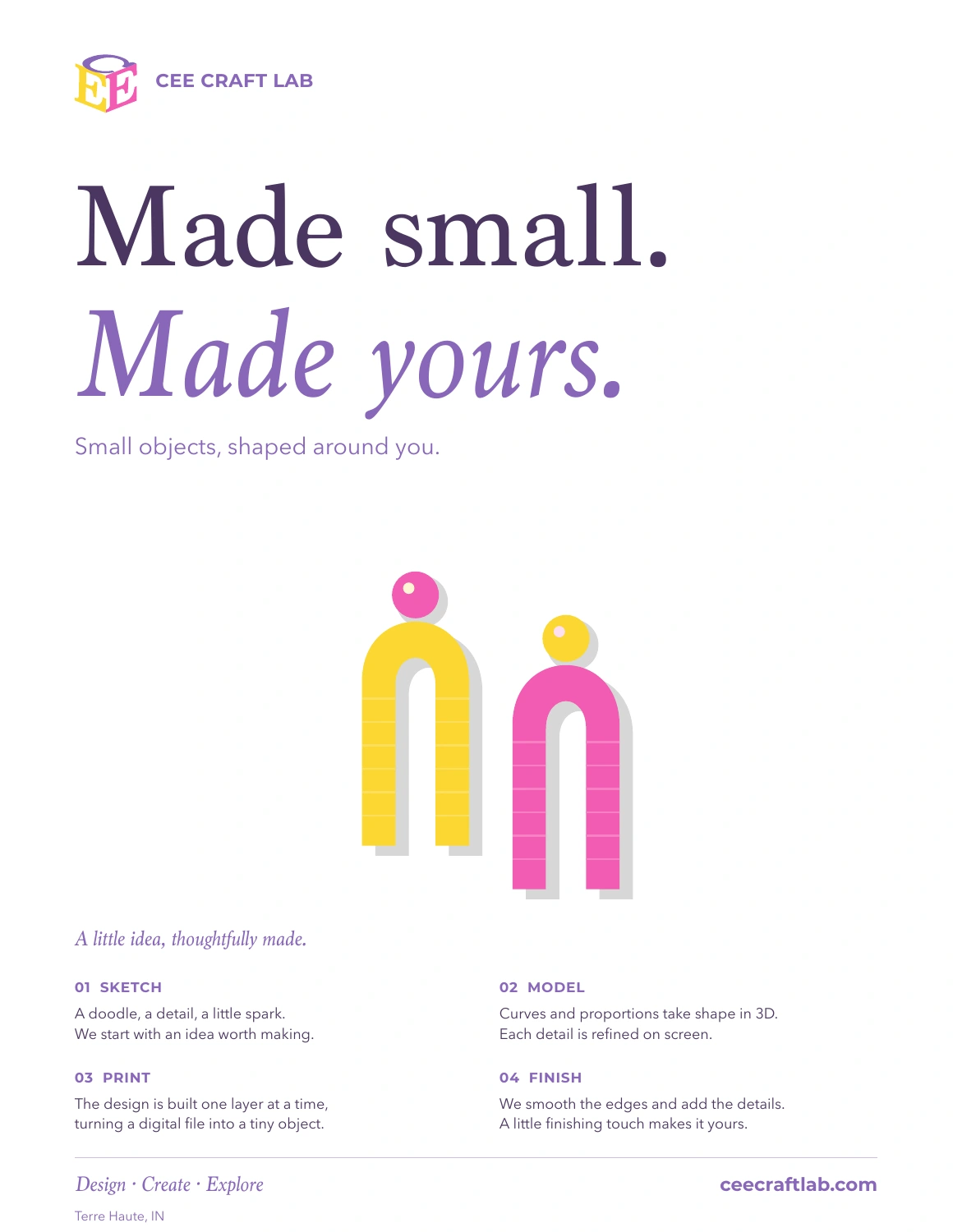
The Week 6 advertising set uses illustrated small objects, large serif headlines, and the same brand colors across four formats. The portrait and square pieces introduce the maker concept; the magazine-style layout has space for a sketch-to-finish story.
The billboard reduces the message to a short headline and logo. Changing the information density makes each composition suit its format instead of simply resizing one design.
Still in progress
The project will continue as new AD450 assignments are developed. The following deliverables are planned, not completed or shown as finished work here.
- BrochurePlanned
- Direct mail piecePlanned
- 8-page bookletPlanned
- Company website homepagePlanned
- Website site mapPlanned