Course study · UX research & wireframing
Google Travel UX Study
An audit and three user interviews led to a simpler trip-planning entry point, more visible flight filters, and a saved-trip concept.
Audit
I reviewed Google Travel’s navigation and trip-planning flow. My audit identified four points of friction: no clear starting action on the homepage, navigation that felt inconsistent between sections, small primary actions, and filters that became hard to reach while scrolling.
The audit was an initial hypothesis, not proof that every visitor experiences these problems.
Research
I interviewed three people with different travel patterns: an annual international traveler comparing long-haul flights, a frequent cross-border traveler focused on speed and price, and a student exploring destinations. Their accounts pointed to the same broad issue: the service offered many options, but the next step was not always obvious.
I used these interviews to develop a primary persona and three journey maps. The sample was small and personal, so the findings are directional rather than representative of all Google Travel users.
Response
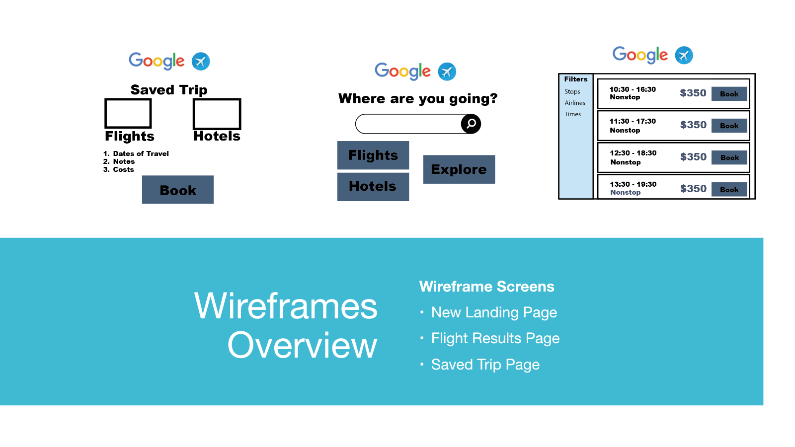
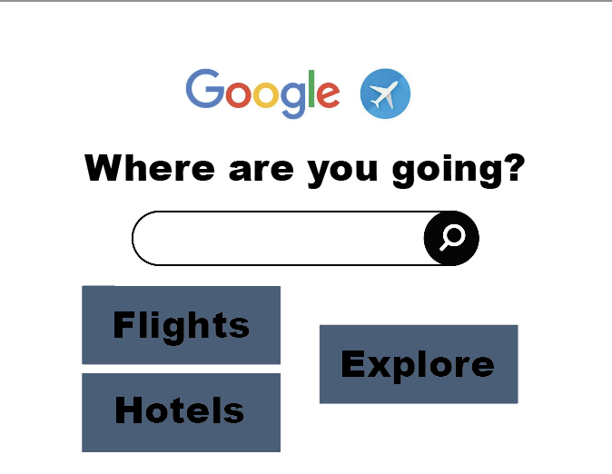
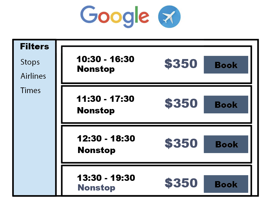
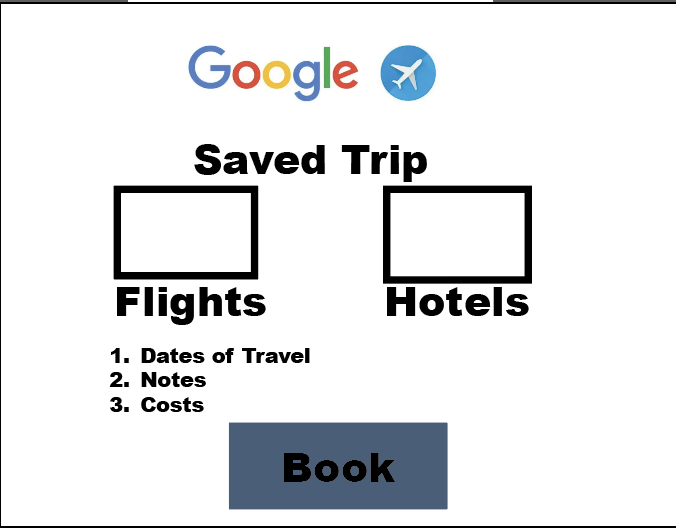
The proposed homepage makes Flights, Hotels, and Explore prominent starting paths. A flight-results wireframe keeps filters visible next to comparable options and makes booking actions larger. A saved-trip wireframe gathers flight, hotel, date, notes, and cost information in one place.
These are low-fidelity concepts to communicate hierarchy and flow, not a coded product or a tested redesign.
What remains
I did not run a usability test of the wireframes or measure task completion. The next step would be to ask new participants to find a flight, apply a filter, and save a trip in a clickable prototype, then revise the design based on observed behavior.